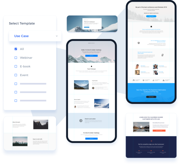
Responsive design is a design approach that ensures that a website looks and functions well on a variety of devices and screen sizes.
Responsive design is a design approach that ensures that a website looks and functions well on a variety of devices and screen sizes.
This is important because more and more people are using mobile devices to access the internet, and you want to make sure that your website is easy to use and navigate on those devices.
How does it work?
Responsive design uses flexible layouts and grid-based design to automatically adjust the layout and formatting of a website based on the size of the device being used to view it.
This means that your website will look great and be easy to use no matter what device a visitor is using.
How can it help my business?
Having a responsive website can help improve the customer experience for your visitors.
If your website is difficult to use on a mobile device, people are more likely to leave and go to a competitor’s site.
But if your website is responsive, it will be easy to use on any device, which can help improve customer satisfaction and encourage more people to stay on your site and engage with your business.
In turn, this can lead to more sales and conversions for your business.
What do I need to consider?
Here are 10 things to consider when building a responsive design website:
- Design for mobile first: Start by designing for the smallest screen size and work your way up to larger screens. This helps ensure that your website looks and functions well on mobile devices.
- Use flexible grids and layouts: Use a grid-based layout and flexible elements like images and text blocks to ensure that your website adjusts to different screen sizes.
- Use responsive images: Make sure that your images are sized properly and use the srcset attribute to serve different image sizes based on the device being used.
- Optimise your navigation: Make sure that your navigation is easy to use on small screens and consider using a hamburger menu for mobile devices.
- Use readable font sizes: Use larger font sizes and line heights to ensure that text is easy to read on small screens.
- Test on different devices: Test your website on a range of devices to ensure that it looks and functions as intended.
- Use media queries: Use media queries to apply different styles based on the width of the device being used.
- Use responsive forms: Make sure that your forms are easy to fill out on small screens and consider using placeholders instead of labels.
- Use responsive videos: Make sure that your videos are properly sized and use the srcset attribute to serve different video sizes based on the device being used.
- Optimise for load time: Make sure that your website loads quickly on all devices by optimizing images, minifying CSS and JavaScript, and using a content delivery network (CDN).
Best tools to help you design responsive websites
- Moqups — Make wireframes, mockups, diagrams, charts, and prototypes within one creative context.
- Instapage — Instapage is a landing page builder and conversion optimization platform designed to help businesses create and publish high-converting landing pages.
- Mockingbird — GoMockingbird is an online tool that helps you quickly create interactive wireframes and prototypes for websites and mobile apps. It’s easy to use and lets you collaborate with others in real-time.
- Designer.io — Designer.io is a powerful design platform that helps teams create beautiful, high-quality designs quickly and easily. It offers a wide range of features, including drag-and-drop design, collaboration tools, and a library of templates and assets.
- ScrollMagic — The javascript library for magical scroll interactions. ScrollMagic helps you to easily react to the user’s current scroll position.
- ThemeFuse — ThemeFuse is a premium WordPress theme provider offering high-quality, modern designs for businesses, bloggers, and creatives. Their themes are easy to customize and come with powerful features like drag-and-drop page builders, SEO optimization, and more.
- Wireframe.cc — A powerful, intuitive app for creating and sharing wireframes.
- Axure RP — The most powerful way to plan, prototype and handoff to developers, all without code. Download a free trial and see why UX professionals choose Axure RP.
- The7 — The7 is a powerful, versatile WordPress theme with over 1000 theme options. It’s fully responsive, SEO-friendly, and comes with a drag-and-drop page builder, WooCommerce integration, and more. Perfect for any website!
- Web Design Ledger — Web Design Ledger is a comprehensive resource for web designers and developers, offering tutorials, articles, and inspiration to help you create amazing websites.
- Phonesites — Phonesites is the easiest and fastest way to start collecting leads. Create pages from your phone or desktop in minutes.
- Astra — Looking for a WordPress theme that’s fast, elegant & customizable? Meet Astra! It’s customizer powered, SEO friendly and compatible with major page builders.
- Skrollr — Skrollr is a JavaScript library that enables developers to create scroll-based animations and interactions. It is lightweight and has a simple syntax, making it easy to use and customize. It is also responsive, allowing animations to be displayed on any device or screen size.
- Bootstrap — Powerful, extensible, and feature-packed frontend toolkit. Build and customize with Sass, utilize prebuilt grid system and components, and bring projects to life with powerful JavaScript plugins.
- TeslaThemes — TeslaThemes is a marketplace for WordPress themes and plugins. They offer high-quality, modern designs that are easy to customize and use. Their themes are perfect for businesses, bloggers, and creatives. They also offer free support and updates.
- Flinto — Flinto is a powerful design tool that helps you create interactive prototypes for mobile, desktop, and web apps.
- WPBakery Page Builder — WPBakery is a powerful page builder plugin for WordPress. It helps you create stunning websites with an intuitive drag-and-drop interface, no coding required. It’s easy to use, fast, and comes with over 50+ content elements and over 200+ pre-made layouts.
- Animatron — Create, host, and share marketing videos with Wave.video, a powerful video marketing platform. Make animations and explainer videos with Animatron Studio.
- Pagecloud — PageCloud is a website builder and content management system (CMS) designed to help businesses and individuals create professional-looking websites without the need for coding skills.
- Avada — The Ultimate Online Store Website Builder Trusted by beginners, marketers & professionals; Built with usability and performance in mind. Trusted by beginners, marketers, & professionals; Built with usability and performance in mind. Start Building 700k+ People Trust Avada 24k+ Average 5-Star Reviews The Ultimate Website Builder Trusted by
- Fullpage.js — Mouse wheel snap to sections. Fast and simple to use.
- Bootstrap Studio — A powerful web design tool for creating responsive websites using the Bootstrap framework.
- CSSIgniter — The Best Free & Premium WordPress themes for 2021. Get complete access for only $69. Theme updates and support included.
- Slider Revolution — Revolution Slider is a powerful, responsive WordPress plugin that helps you create beautiful, interactive slideshows. It features an intuitive drag-and-drop editor, advanced animation options, and a library of pre-made templates to get you started quickly.
- Wix — It starts with a website. Build on a platform that gives you the freedom to create, design, and grow online exactly the way you want.
- JustInMind — Easily create web and mobile app prototypes and wireframes with Justinmind UI prototyping tool.
- Enfold — Enfold is a powerful, responsive WordPress theme. It features a drag & drop page builder, advanced theme options, and a wide range of customization options. It’s perfect for creating professional websites with ease.
- GetResponse — No matter your level of expertise, we have a solution for you. At GetResponse, it’s email marketing done right. Start your free account today!
- Bootstrap Themes — Bootstrap is a free, open-source front-end library for creating responsive, mobile-first websites. It includes HTML and CSS-based design templates for typography, forms, buttons, navigation and other interface components, as well as optional JavaScript extensions.
- MyThemeShop — Our Premium WordPress Themes and Plugins are a perfect solution for ANY online presence. All these beautiful responsive themes and plugins are made for YOU.
- Responsive Design Best PracticesHow can I create a responsive website with the best design practices?Responsive Design Best Practices
- Responsive Design vs Mobile App DevelopmentResponsive Design or Mobile App? Which is best for your website?Responsive Design vs Mobile App Development
- Responsive Design and AccessibilityHow can we make our web designs both responsive and accessible?Responsive Design and Accessibility
- Responsive Design and SEOHow can I optimize my website for both responsive design and SEO?Responsive Design and SEO
- Responsive Design and E-commerceHow can I optimize my e-commerce site for mobile users with responsive design?Responsive Design and E-commerce
- Responsive Design and Performance OptimizationOptimize your website for different devices and improve performance? Responsive Design & Performance Optimization.Responsive Design and Performance Optimization
- Responsive Design PrinciplesHow can I create a website that looks great on any device? Learn the principles of responsive design.Responsive Design Principles
- Responsive Design FrameworksWhich responsive design framework is best for your project? Compare features & benefits to find the right one.Responsive Design Frameworks
- Responsive Design ToolsTools to help create responsive websites: What are the best options?Responsive Design Tools